
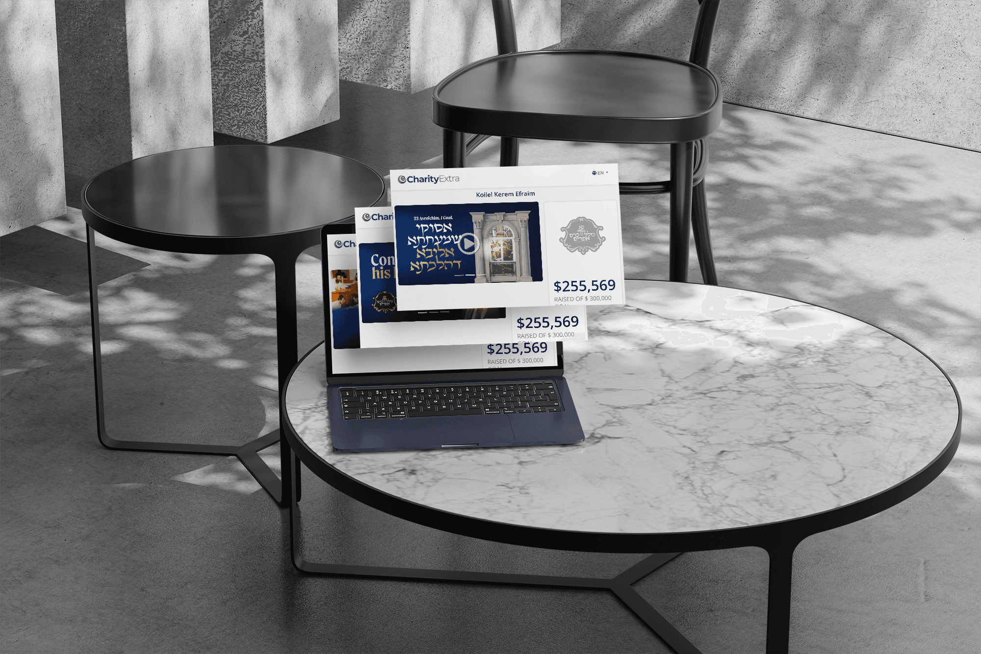
Kollel Kerem Efrayim Campaign
A prestigious halacha kollel that couldn't look like every other kollel — but couldn't look unfamiliar either. We built an abstract kaf-alef monogram and set it on a Greek pillar: Amud HaHoraah, made literal, and unmistakably malchusdik.
Kollel Kerem Efrayim is an established, chashuve kollel focused on halacha and building the next generation of Morei Horaah — and it had a campaign coming with no logo to its name. The design problem pulled in two directions at once. Every kollel reaches for the same open sefer, and that wasn't going to work for a place of this standing. But the answer couldn't drift too far the other way either: it still had to read as mechubadik and recognisably a kollel, not as something clever for its own sake.
The solve was to build the identity out of the kollel's own name and purpose rather than the usual iconography. The kaf and alef of Kerem Efrayim are intertwined into a single abstract symbol — the kaf sitting so naturally within the alef that it reads as one of its legs — giving the mark something malchusdik and distinctive that no other kollel has. That symbol then sits on a Greek pillar, which does two things at once: it's the classical symbol of law, and it turns Amud HaHoraah from a phrase into an image. The pillar also carries the weight the brand needed — elegant, royal, chashuv — so the identity feels established from the moment you see it. From that single mark, everything else followed: the campaign emblem, animated banners, and the campaign ad.
““Working with you was an absolute pleasure. Every step of the way was with utmost professionalism, response time was always swift, and the final results were absolutely stunning.””